TsSkinProvider
This component manages skinning of each separate form where it is placed. Despite the fact that it is created automatically (if TsSkinManager.SkinningRules.srStdForms is True), it is recommended to put this component on the form in design-time. This contributes to better controlling of the form, improves an animation of forms showing and many other operations. Also, this component contains
many additional settings that help to influence the best skinning of the form where it is used.
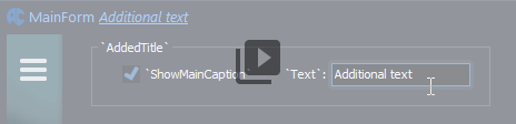
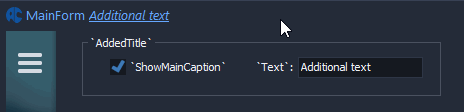
The AddedTitle property allows to define an additional text which will be shown after the form caption. Additional text will be shown using custom font options.
AllowAnimation can allow/forbid animation effects for the form-owner.
AllowBlendOnMoving can allow/forbid a semitransparency effect for the dragged form-owner.
AllowExtBorders can allow/forbid an extended borders on the separate form.
AllowSkin3rdParty can allow/forbid a skinning of standard or third-party controls on the form-owner. Also, the ThirdParty property of the TsSkinManager or TsSkinProvider should be configured.
CaptionAlignment specifies a text aligning in the form title bar area.
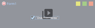
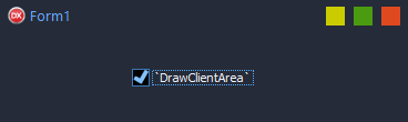
DrawClientArea allows to disable a skinning of client area of the form. It's may be useful if drawing of borders and form titlebar only is needed.
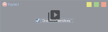
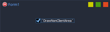
DrawNonClientArea allows to disable a skinning of nonclient area of the form. It's may be useful if thirdparty ribbon control is used and this control draws a nonclient area too.
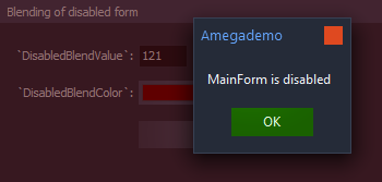
DisabledBlendColor - color of fading when the DisabledBlendValue property used
DisabledBlendValue allows to fade the form if this form is diabled. Use this property if fading of form is required when other modal form or dialog are shown and Enable property of the form is False.
DisabledBlured allows to blur the form if this form is diabled.
FormHeader Specifies an additional space in pixels which will be used for the form header drawing. This property used only if 'FORMHEADER' section is defined in the current skin (the `Windows 10` skin has this feature for sample).
GluedForms This list contains names of forms which will be clued to the current form automatically (will be moved together with current form). This property works if SkinManager is active only.
GripMode enables a drawing of additional grip area in the lower right corner of the form. Works the same as grip in the TStatusBar component and helps you resize the form.
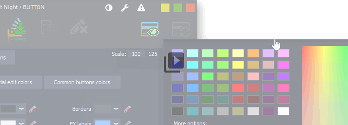
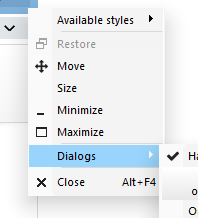
MakeSkinMenu defines when needed an adding of a special submenu to the system menu. This submenu contains a list of all available skins and can be used for a changing of the current skin.
MenuLineSkin defines a special skin section for the menu line.
ScreenSnap - analogue of standard feature, which appeared in the latest versions of Delphi. The property is used to create a sticking of form to the screen edges.
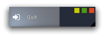
ShowAppIcon allows to hide an icon of form in the title.
The SkinData property is a common property for all components from the package and contains common options for a drawing of component.
-
CustomColor allows to use an own color of component which is defined in the "Color" property. Color from current skin will be ignored for this component.
-
CustomFont allows to use an own color of component font which is defined in the "Font.Color" property. Font color from current skin will be ignored for this component.
-
SkinManager defines a skin manager which will control a drawing of the component. By default it's a skin manager which have the "IsDefault" property as True.
-
SkinSection defines a skin section which specifies a look of component.
SnapBuffer sets the distance from the edge of the screen to the form in which starts a sticking effect.
SysSubMenu allows to add an own submenu to the system menu of the form.
The SystemBlur property enables bluring of the form, which used for creation of the fluent panel effects. The Active subpropertry used for activation of the bluring effect. The Mode subproperty used for choosing of type of the bluring (bmBlurBehind works under Windows 7 and newer, bmAcrylicBlurBehind works under Windows 10 only).
The ThirdParty property overrides SkinManager.ThirdParty list and can add more possibilities in customizing of third-party controls skinning. Used if not empty, otherwise the SkinManager.ThirdParty list has a first priority.
TitleBar defines the TsTitleBar component, which will be used in this form.
TitleButtons defines a set of buttons which will be placed on the form title. This property was obsolete after a creation of the TstitleBar component which have much more possibilities in adding of new items to the title. The TitleButtons property was leaved temporary for a compatibility with old versions of the package.
TitleIcon controls drawing of form icon in the title. After clicking on this icon the system menu is shown. The property allows to define a new icon for the form and define a size of the drawn icon.
TitleSkin defines a special section which will be used in drawing of the title.
UseGlobalColor allows to change the Form.Color property by current skin. I this case all unskinned controls with ParentBackground property will inherite this color.
The UWPMode property changes a behaviour of the form for emulating of Universal Windows Platform design (UWP).
If property is True then titlebar and borders of forms are hidden but form works with resizing as usual. Using of the TsSysButton component is recommended for showing of system buttons.