TsAlphaHints
Controls a drawing of tooltips in the application with or without skins. To get this component working, it is enough to place him to the main form of application. He has one basic style already, this style is configured and used as default. That's all! Hints will be drawn automatically now while the Active property is True.
A variety of styles may be made by changing of component settings. For managing styles there is a special design-time editor of the Templates property.
Unlike TsHintManager component, the TsAlphaHints manager can draw hints with any shape. TsHintManager is obsolete and remains in the package for compatibility. Component TsAlphaHints more promising and preferable to use.
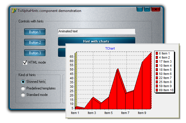
Thanks to the TsAlphaHints tips may have a text formatting using Html tags, can display images and graphs. Animated hints may be produced also. Example of use can be seen in this demo .
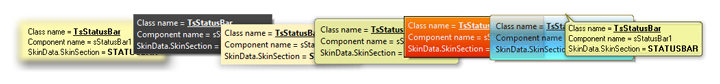
The component can apply user defined styles, and can use styles defined in the current skin, if it is active. The UseSkinData property should be enabled for using of styles from skin. Each skin has the 'HINT' section, where defined a data which used for drawing.
ShowHint and HideHint procedures may be used for a forced showing and hiding of hint window.
The RepaintHint procedure refreshes an opened hint window. Usually this procedure used during data changing and allow to create an animation effect.
 The DefaultMousePos property specifies a location of arrows in the baloon-like hints that will be used by default.
The readonly IsHintShowing property is True when the hint window is shown already.
OnShowHint event
Allows to control a process of hint showing with using of set of parameters :
-
HintStr defines a text which will be shown
-
CanShow allows or forbids a showing of the hint. Allows to forbid a showing of the hint depending on certain conditions during an application executing.
-
HintInfo contains the THintInfo record, in particular allows to specify a location of the hint window.
-
Frame allows to draw TGraphicControl`s in the hint window. More information about this feature may be found below
Hypertext in hints
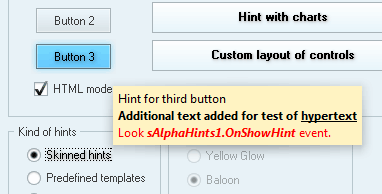
Text formatting is possible with standard Html tags, such as FONT, B, I, U. Tags should be added directly to the Hint property of control and they are not visible in the output, if the HTMLMode property is enabled.
Forced line break may be set by BR tag
Special character such as ©, ™ and others are supported.
Using of frames in hints
The OnShowHint event contains the Frame:TFrame parameter. If we create a frame containing TGraphicControl `s, then these controls will be copied to the hint window. This feature allows to display text together with images, graphics, etc.
Frame is destroyed automatically during closing of hint.
Let's create a hint with frame:
-
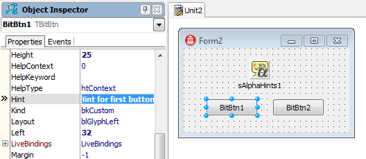
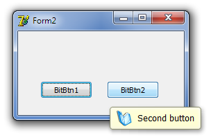
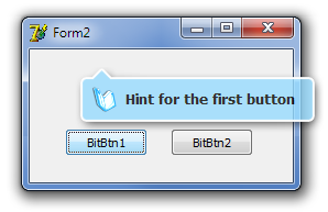
Create an application with TsAlphaHints component on the form. Create a frame with components located on it, inherited from TGraphicControl. Controls should be placed as they should be shown in hint. They can be arranged as it's needed, but we chooses an easiest variant. Two buttons are placed to the form for test and Hint property is defined. ShowHint property is True.
-
Add a handler to the OnShowHint event. Create a frame there which will not be visible (Parent = nil). Change a text of the Label, taking his from HintStr parameter.
uses Unit1;
procedure TForm2.sAlphaHints1ShowHint(var HintStr: string; var CanShow: Boolean;
var HintInfo: THintInfo; var Frame: TFrame);
begin
Frame := TFrame1.Create(Application);
TFrame1(Frame).Label1.Caption := HintStr;
end;
-
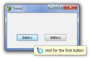
That`s all, we can run the project and see a result.
-
As we can see, there is one problem. It lies in the fact that regardless of width of text, window width remains unchanged. We solve this issue by adding a single line to the OnShowHint event handler. We oriented on width of the Label here, because AutoSize property of this control is True.
Frame := TFrame1.Create(Application);
TFrame1(Frame).Label1.Caption := HintStr;
Frame.Width := TFrame1(Frame).Label1.BoundsRect.Right + 4;
The width of hint window will vary depending on the size of the displayed text now.
Configuring of Png template
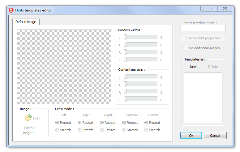
Using Png images as templates allows to create hint windows almost any shape. To set the template uses the special Template property editor, which may be called at design-time.
The previous example uses a template, which is default and is in the application resources.
Let's try to define a template and apply it in this example.
-
Create an image in Png format, which will be used as a template.
-
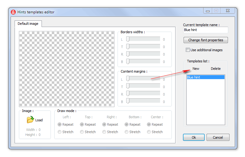
Create a new template ("New" button) in the editor and call it "Blue hint".
-
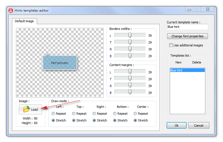
Add a created image
-
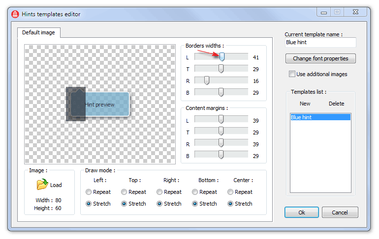
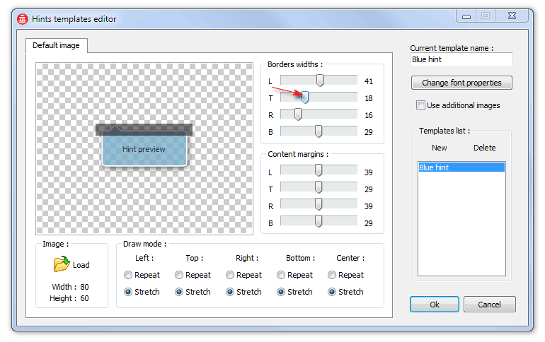
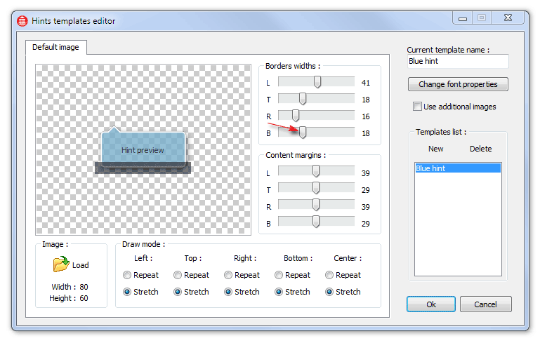
Define sizes of borders together with shadows
-
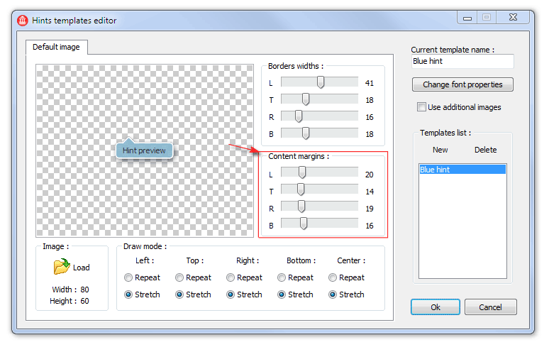
Specify a distance from edge of the hint window to its contents
-
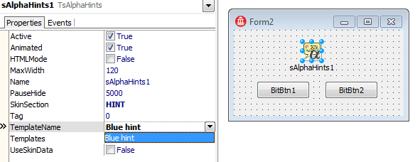 If we will not use the Frame with Label, we might define a font for the template. But in our example the font is set directly in the Label, I just added the fsBold property. Now, we can press OK and "Blue hint" template will be added to the component. For applying of the new style in the application, select it in the TemplateName property.
-
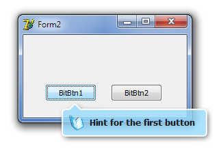
After running the application we can look at the result.
Not bad for a first time :) But what if hint window will be displayed over the control? This happens if control is too close to the bottom of the screen. The arrow will be painted on top, and it's certainly not good.
There are three additional tabs in the template editor for such cases. They are enabled if "Use additional images" checkbox is set. "Right-top", "Left-Bottom", "Right-Bottom" tabs allows to specify images where arrow should be drawn in the appropriate corner.
Additional images may be drawn and configured same as primary image.
Transfering the TsAlphaHints component with customized styles from one project to another may be produced by Copy/Paste at design-time.
The sample project may be downloaded there (~7Kb)