Updated: Dec 16, 2023
Follow on twitter

Non-standard possibilities of components in the package

Properties common for all components
• BoundLabel

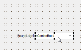
This property is available in all edit controls (TsComboBox, TsMaskEdit, TsSpinEdit and others). The property allows to add a label which will be near the edit control always and moved automatically together with this control. Options which are available in this property:

  • Active - creates a label for the control
  • Caption - text of the label
  • Font - specifies a font of the label. Change the UseSkinColor property to True if custom font color should be used.
  • Indent - space between a label and an owner control
  • Layout - specifies a position of a label
  • MaxWidth - maximum width of a text block (text is wrapped automatically if width is bigger than MaxWidth)
  • UseSkincolor specifies that color of text should be receive from current skin. Otherwise, the Font.color property will be used.

• AnimatEvents

The property is available in buttons from the package and in the TsCheckBox, TsRadioButton and TsTrackBar. Property defines events when will be used animation of component. Each button have own animation options. Animated control changing may be occured in four mouse events(mouse entering and leaving, left button down and up). If aeGlobalDef is enabled then will be used global animation options from TsSkinManager.AnimEffects.Buttons.Event property. In this case we can control behaviour of animation effects for all buttons from one point.

• DisabledKind

This property is available in buttons, edit controls and many other components. Defines looking of the disabled control. Available options:

  • dkBlended - if True then control is drawn alphablended. Blend value , used by definition, is equal to 0.4 and declared in the sDefaults.pas file
  • dkGrayed - if True then control is drawn with changed saturation. Saturation value DefDisabledGrayed>, used by definition, is equal to -90 and declared in the sDefaults.pas file

• SkinData

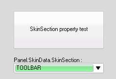
This property is available in most visible controls and allows to change a skin options in separate control. Available options:

  • CustomColor - ensures that a control is drawn with account of the standard Color property value
  • CustomFont - ensures that a control is drawn with account of the standard Font property definitions
  • SkinManager - specifies the TsSkinManager component which will be used for skinning of the component
  • SkinSection - contains a skin section name for this control. SkinSection allows to change a looking of the control by using of defined section from skin.

Some components (buttons, for sample) have HUEOffset and Saturation options in the SkinData property. These options allows to change color tones in separate control.

The SkinData.Invalidate procedure completely repaint skinned control (standard Invalidate procedure can work not always because sometimes a control image is in the skin cache and this cache image should be updated too).

SkinData.BeginUpdate and SkinData.EndUpdate procedures forbids and allows a control repainting accordingly.


List of additional properties in analogues of standard controls
TsLabel

  • SkinSection - contains a skin section name for this control. SkinSection allows to change a looking of the control by using of defined section from skin.
  • UseSkinColor allows to disable a using of font color from the current skin. Caption will be shown with color which has been defined in the Font.Color property.

TsMemo

  • The OnScrollCaret event occurs when caret is moved in the edit control.
  • The OnVScroll event occurs after vertical scrolling of the component.

TsButton

Properties which occured in latest versions of RAD studio are supported and exists in the TsButton under old Delphi versions: CommandLinkHint, DisabledImageIndex, DropDownMenu, HotImageIndex, Images, ImageAlignment, ImageIndex, ImageMargins, PressedImageIndex, SelectedImageIndex and Style.

Added properties:

  • ContentMargin defines a space between borders of the button and content of this button.
  • Reflected enables a glass reflection effect for the glyph (if glyph exists).
  • ShowFocus determines whether focus rectangle is displayed on the button when control is focused.
  • Down - the button will be painted as pressed if this property is True.

TsCheckBox and TsRadioButton
  • AutoSize enables automatic changing of the control size when his content is changed.
  • GlyphChecked and GlyphUnChecked allows to specify glyphs for different states of the component.
  • ImgChecked è ImgUnChecked identifies the image associated with this component.
  • Images lists images available for showing in the component.
  • Margin defines a space between control borders and content.
  • ReadOnly allows to disable changing of the control by user.
  • ShowFocus determines whether focus rectangle is displayed on the control.
  • TextIndent defines a space between glyph and caption.
  • VerticalAlign defines a vertical alignment of glyph in the control.
  • WordWrap supported in TsCheckbox under old versions of Delphi. Specifies whether the button text wraps to fit the width of the control. Set WordWrap to true to allow the display of multiple lines of text when AutoSize property is False.
  • The OnValueChanged event occurs after changing of the component value.

TsListBox

  • AutoHideScroll allows to hide a vertical scrollbar of the component when this scrollbar is not needed.
  • The OnVScroll event occurs when component is scrolled vertically.

TsComboBox

  • VerticalAlignment controls a vertical position of items values. This property works when component is skinned.

TsGroupBox

Properties which allows to change a looking of caption, works with active skins only:

  • CaptionLayout defines a layout of caption text.
  • CaptionMargin defines a space between caption abd control borders.
  • CaptionYOffset - vertical offset of caption and client area of the component.
  • CaptionSkin contains a skin section name for the caption.
  • CaptionWidth - width of caption. If this property is 0, then size of caption calculated automatically.

TsPanel

The OnPaint event occurs when the control is painted. Use the Canvas property to draw the control’s image. If control is skinned then this event occurs when cache image is in preparing. It happens automatically usually, but, if you needed to change a cache image manually, then set the sPanel1.SkinData.BGChanged flag to True.

TsBitBtn

  • The Alignment property specifies how content is aligned within the button.
  • Blend - blending percent of the glyph. Use this property for defining the looking of glyph if button is not active (normal state).
  • DisabledGlyphKind specifies algorithm for automatical drawing of glyphs at disabled buttons.
  • Down - the button will be painted as pressed if this property is True.
  • DrawOverBorder specifies an order how to draw the button elements. If property is False then glyph and caption are painted before button`s borders. This property may be useful if elements of border should be painted on a glyph.
  • FocusMargin defines a space in pixels between caption text and focus rectangle.
  • Grayed - reset a color saturation of glyph if button is not active (normal state). Glyph will be grayed or will have a colors of button (depended from current skin).
  • ImageIndex determines which image appears on the button.
  • Images lists the images that can appear on tool buttons.
  • Reflected enables a glass reflection effect for the glyph (if glyph exists).
  • ShowCaption determines whether text caption is displayed on the button.
  • ShowFocus determines whether focus rectangle is displayed on the button.
  • TextAlignment specifies how text is aligned within the button.
  • TextOffset - spacing between a text caption and glyph.
  • WordWrap specifies whether the button text wraps to fit the width of the control.

The OnPaint event occurs when the control is painted. Use the Canvas property to draw the control’s image. If control is skinned then this event occurs when cache image is in preparing. It happens automatically usually, but, if you needed to change a cache image manually, then set the sPanel1.SkinData.BGChanged flag to True.

TsSpeedButton

  • The Alignment property specifies how content is aligned within the button.
  • Blend - blending percent of the glyph. Use this property for defining the looking of glyph if button is not active (normal state).
  • ButtonStyle specifies a mode of work of button. Available styles:
    1. tbsButton - the button is painted and working as usual SpeedButton. This is default mode.
    2. tbsDropDown - the button have a drop down arrow and uses the DropDownMenu property for showing popup menu.
    3. tbsSeparator - the button appears as an empty space (used to separate other controls).
    4. tbsDivider - the button appears as a vertical line (used to separate other controls).
  • DisabledGlyphKind specifies algorithm for automatical drawing of glyphs at disabled buttons.
  • DrawOverBorder specifies an order how to draw the button elements. If property is False then glyph and caption are painted before button`s borders. This property may be useful if elements of border should be painted on a glyph.
  • DropDownMenu identifies a pop-up menu associated with the TsSpeedButton.
  • FocusMargin defines a space in pixels between caption text and focus rectangle.
  • Grayed - reset a color saturation of glyph if button is not active (normal state). Glyph will be grayed or will have a colors of button (depended from current skin).
  • ImageIndex determines which image appears on the button.
  • Images lists the images that can appear on tool buttons.
  • Reflected enables a glass reflection effect for the glyph (if glyph exists).
  • ShowCaption determines whether text caption is displayed on the button.
  • TextAlignment specifies how text is aligned within the button.
  • TextOffset - spacing between a text caption and glyph.
  • WordWrap specifies whether the button text wraps to fit the width of the control.

The OnPaint event occurs when the control is painted. Use the Canvas property to draw the control’s image. If control is skinned then this event occurs when cache image is in preparing. It happens automatically usually, but, if you needed to change a cache image manually, then set the sPanel1.SkinData.BGChanged flag to True.

This component has a splitted part with arrow, when OnClick event is defined. Component has two behaviours in this case, may be clicked and have PopupMenu. If OnClick event is not defined, then component have one behaviour and used for showing of menu only. Content of component is not splitted in this case.

TsScrollBox

The AutoMouseWheel property enables an automatic scrolling of ScrollBox by mouse wheeling.

The OnPaint event occurs when the control is painted. Use the Canvas property to draw the control’s image. If control is skinned then this event occurs when cache image is in preparing. It happens automatically usually, but, if you needed to change a cache image manually, then set the sPanel1.SkinData.BGChanged flag to True.

Also, OnAfterScroll, OnBeforeScroll, OnMouseEnter and OnMouseLeave events were added.

TsCheckListBox

The HeaderSkin property specifies a skin section which will be used for painting of component headers.

TsSplitter

  • Glyph allows to change an image which used in the component as Grip area.
  • ShowGrip determines whether grip area is displayed on the splitter.
  • Added OnMouseEnter and OnMouseLeave events.

TsPageControl

In the TsPageControl component were added some non-standard and powerful possibilities: possibility of Close buttons showing on component`s tabs, new modes of tabs using (as usual tab and as button with dropdown menu), rotation of captions for 90 degrees.

New properties:

  • AccessibleDisabledPages allows to close access for user to disabled pages.
  • ActiveIsBold enables showing of active tab caption with using of bold font.
  • CloseBtnSkin specifies a skin section which used for painting of Close buttons.
  • RotateCaptions enables a rotating of captions text for 90 degrees.
  • ShowCloseBtns enables a showing of Close buttons on tabs. You can disable a showing of such button on seperate pages using the TsTabSheet.UseCloseBtn property.
  • TabPadding specifies a padding for all tabs of component.
  • The OnPageChanging event allows to forbid a page changing before a new page activation.
  • Also, added OnCloseBtnClick, OnDblClick, OnTabMouseEnter and OnTabMouseLeave events.

The DeletePage procedure is declared in the sPageControl unit, This procedure allows to remove a page without an automatic first page activation.

TsTrackBar

  • ThumbGlyph allows to change an image which will be used for painting of component thumb.
  • BarOffsetV and BarOffsetH specifies an offset of client area of the control. Used with active skins only.
  • The OnUserChange event occurs when thumb is moved by user.
  • The OnSkinPaint event occurs when component is painted and allows to add own paintings.

TsGauge

  • CalcPercents allows to disable a calculation and output of progress in percents. If this property is False, then value of the Progress property is shown.
  • ShowText determines whether text is displayed.
  • Suffix contains a text which will be added to the progress text.
  • The OnPaintText event occurs before a showing of text and allows to change a text which will be shown in component.

TsSpinEdit

  • The Alignment property specifies how text is aligned within the component.
  • EditorEnabled allows to forbid a changing of value by a direct editing. Using of Up/Down buttons is still allowed in this case.
  • AllowNegative allows or forbids using of negative numbers in the component.
  • ShowSpinButtons determines whether spin buttons are displayed.
  • NextTabControl and PrevTabControl properties specifies a previous and next controls accordingly, which will be focused after tabulation.
  • OnDownClick and OnUpClick evant occurs after clicking on Up/Down buttons of component.

TsImage

  • The Blend property specifies a blend value for a displayed image.
  • ImageIndex determines which image appears on the button.
  • Images lists the images that can appear on tool buttons.
  • Grayed - reset a color saturation of image.
  • Reflected enables a glass reflection effect for the image.
  • UseFullSize determines a way how a size of image will be calculated when AutoSize property is True. If UseFullSize is True then height of image is calculated with height of reflection (if exists).


Installing, using and licensing the demo programs © Sergii Goncharov, Ukraine, Odessa 2004-2023