|
NO WAR IN
UKRAINE!
 Home
Products
Skins gallery
Tutorials
Buy
Downloads
Demo-apps
Updates history
Feedback
Customers
Partners
Forum
Sign up for news
Windows 11
Compatible
|
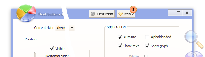
New in the AlphaControls 2017 (version 12)New componentsTsFloatButtons
 Download and look the demo-application
TsArcHandle
 Use a TsArcHandle button in applications wherever you need to provide the user with a rotating button that resembles a knob. This arc dial control variates its Value in degrees, so if you want to use it as a linear control for varying the progress of a progress bar, for instance, use the TextContent property (available values: tcAngle, tcCustom, tcPercent, tcValue). Control whether this arc dial component disp+++lays the value or not using the ShowText property. Use Images and ImageIndex properties for showing of a custom glyph. TsArcDial
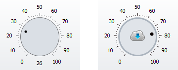 Use a TsArcDial button in applications wherever you need to provide the user with a rotating button if value of the control should have minimal and maxmal values. Control whether this arc dial component displays the value or not using the ShowText property. Use Images and ImageIndex properties for showing of a custom glyph. TsArcGauge
 Use Min, Max and Position properties for controlling of the component value. Control whether this component displays the value or not using the ShowText property. Use Images and ImageIndex properties for showing of a custom glyph. TsArcPreloader
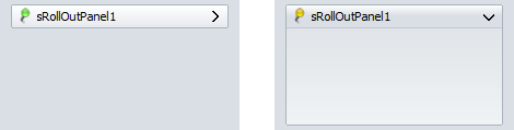
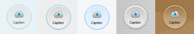
 Use the ImageType property for specifiyng of a control style. Available values: itLine (default), itMask1, itMask2, itCustomImage, itCustomMask. If itCustomMask option is choosen then changing of the image color is possible by the LineColor property. Use the MotionType property for changing of animation type. Animation process may be started or stopped byt the Animated property. Control whether this component displays the value or not using the ShowText property. Use Images and ImageIndex properties for showing of a custom glyph. TsRollOutPanel
 TsRoundBtn
 TsImgLabel
 Download and
look the demo-application with these new controls
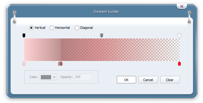
New propertiesGradients with semi-transparency Added possibility of using gradients with custom opacity values in skins. A special editor has been added in the ASkinEditor tool.
Added support of new gradients in the TsGradientPanel component. 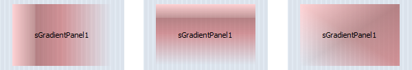 TsFrameBar.DragItems The property allows to reorder items by mouse in the run-time.  If the DragItems property is enabled then all items are collapsed and may be moved by user. Use the Items collection for saving/restoring of items order when application is closed/runned. The UseAlpha property in the TsColorDialog and TsColorBox components The property allows to specify a value of the alpha-channel in the selected color. 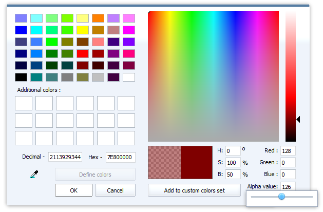 Keep disabled this option if label should have own custom font. Use this event if own painting should be made in the TitleBar items. Use this parameter if scroll buttons should not be visible. This parameter allows to show an animated arrow in the TsFrameBar items. New "acntUtils.pas" unit with some GDI+ procedures addedprocedure acgpDrawEllipse(DC: hdc; X, Y, Width, Height: Single; Color: TColor; PenWidth: Single = 1);Draws an ellipse without a filling. Draws a line that connects two points. Fill the interior of an ellipse by custom color. Stretches a rectangle from a sources bitmap to destination bitmap. Draws an arc representing a portion of an ellipse specified by a pair of coordinates, a color, angle, a width and a height. Uses a brush to fill the interior of a rectangle. Uses set of points and set of colors to fill the interior of a rectangle gradient. Uses two colors to fill the interior of a rectangle by horizontal gradient. Uses two colors to fill the interior of a rectangle by vertical gradient. Other changesNew type of default arrowsAdded possibility to change a style of all arrows. The "Arrows style" field has been added in the ASkinEditor tool (the "General skin options"/"Additional" page). 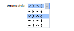  Type of the TsSpinEdit value changed from Longint to Int64 The TsSkinProvider.ResizeMode property is obsolete and has the rmStandard value only (for a backward compatibility) 
|
|
Installing, using and licensing the demo programs
© Sergii Goncharov, Ukraine, Odessa 2004-2023
| |
 This component is a collection of buttons which may be placed in any place of form, including borders and title area.
Buttons are placed over all other controls.
They may be painted using current skin sections, standard Windows theme or custom images.
This component is a collection of buttons which may be placed in any place of form, including borders and title area.
Buttons are placed over all other controls.
They may be painted using current skin sections, standard Windows theme or custom images.
 Represents a general-purpose knob-style rotating button.
 Represents a knob-style rotating button with specified minimal and maximal values and with arc dial.
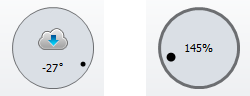
 A simple arc style gauge with support of AlphaSkins.
 A simple animated indicator of any loading process.
 Panel which have a title button and may be collapsed/expanded with all content.
 Round button with changeable radius.
 Label with possibility of glyphs showing.