|
NO WAR IN
UKRAINE!
 Home
Products
Skins gallery
Tutorials
Buy
Downloads
Demo-apps
Updates history
Feedback
Customers
Partners
Forum
Sign up for news
Windows 11
Compatible
|
New in the AlphaControls 2018 (version 13)New componentsTsRangeSelector
 TsCharImageList
This component may be used as usual ImageList component for showing of glyphs in buttons, menus and any other elements of the application. 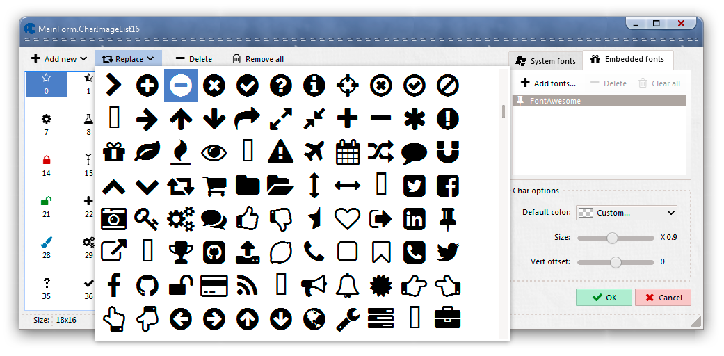
Custom font may be embedded into this component by few clicks of mouse and may be used as source of glyphs on other machines. The TsCharImageList component has the popular symbol font embedded as default ('FontAwesome' font license). This font is free, has more than 700 icons and may be used as source of icons in all projects where the TsCharImageList component is available. Each glyph may have own custom color. Otherwise (if color is clNone) glyph will have a current color of text in the drawn element. Glyph color may be customized with using of special properties like GlyphColorTone in buttons, or AddedGlyph.ColorTone in all edit controls. Also, size and vertical offset of the each glyph may be calibrated in the design-editor if needed. Work of the component and design-time editor may be viewed in the Compiled demo (the "ImageLists" page). TsBadgeBtn
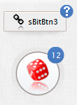
The TsBadgeBtn component may be pinned to the left-top, left-bottom, right-top and right-bottom corners of the parent control and changes own position automatically accordingly with position of the parent control. The component is inherited from the TsRoundBtn component and have all properties (caption, image, image indexes, custom coloring, etc...) and events which implemented in the TsRoundBtn component. TsSplitView
Download Compiled demo with sources. TsFontStore
After the application starting all embedded fonts are activated and available for using in this application. The font may be used as any other installed font and may be selected by his name in the Font.Name property. The design-time editor of the component is shown below. 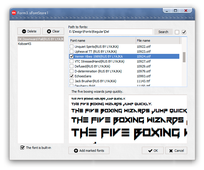
Download and look the executable demo-application
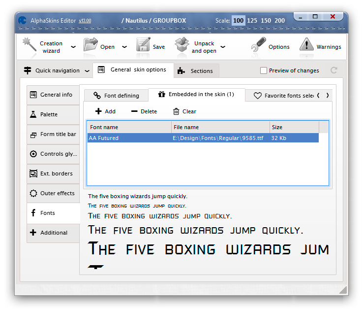
New featuresEmbedding of custom fonts in skins Added possibility of embedding of custom fonts into skins. 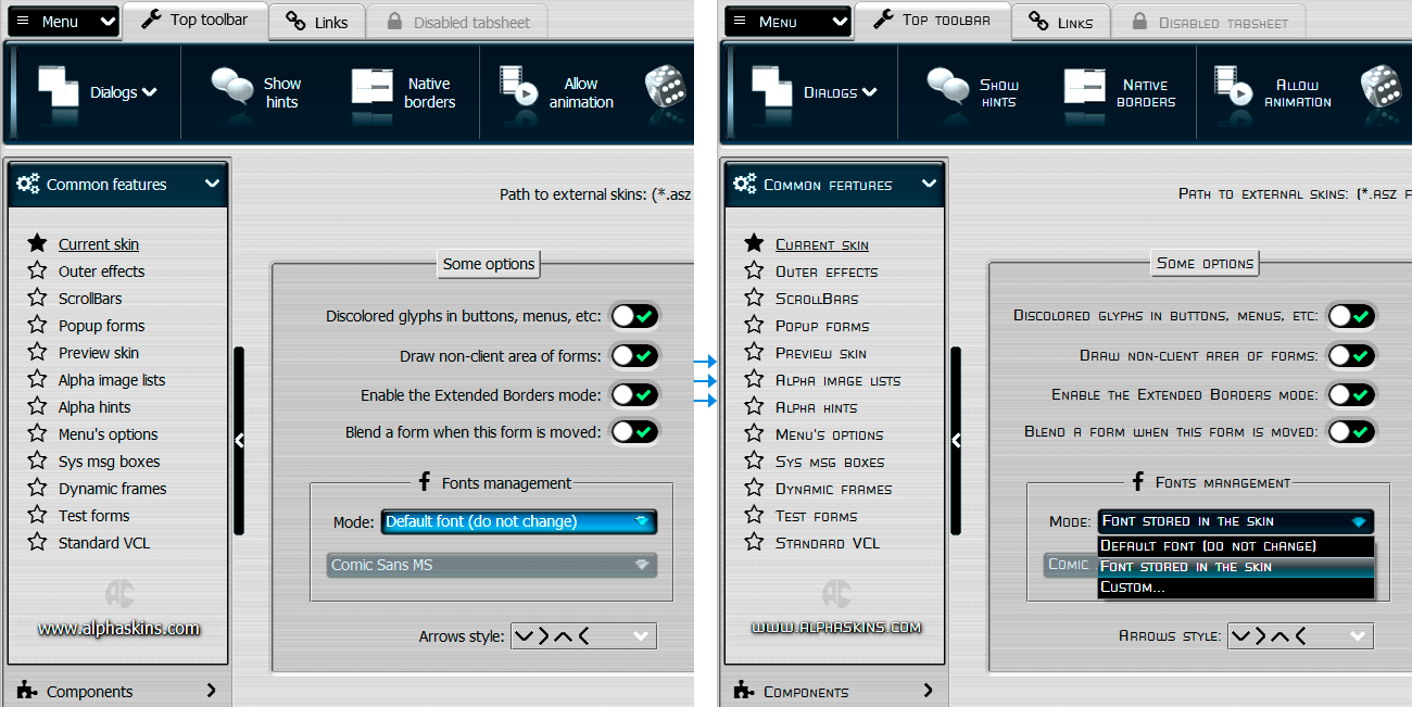
RightToLeft BidiMode in the TsPageControl RightToLeft BidiMode is supported in tabs now. 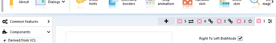
Popup menu for pages choosing in the TsPageControl The button with menu was added near the UpDown buttons. This menu allows to change current ActivePage quickly without scrolling of pages. 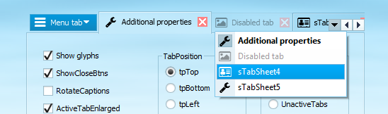
Download Compiled demo with sources.
New propertiesTsSkinManager.Options.Fonts property Added posibility to control of used application font from one point. TsSkinManager.Options.Fonts.MainMode sub-property specifies a mode of fonts using in application. Three options exists there:
The GlyphUtils.Enable property in comboedits Added possibility to disable buttons in the combo edits. 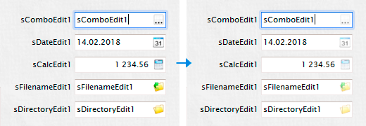
All combo edits has many possibilities in customizing of buttons. The TsRollOutPanel.DirectionArrow property Allows to control a direction of arrow in the component title. The AddedGlyph property in all edits of the package Shows a custom glyph in the control. 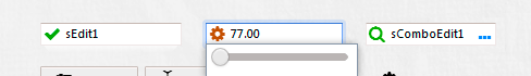
Custom glyph may be defined by the Images and ImageIndex sub-properties. Opacity of glyph may be controlled by Blend sub-property. If Grayed sub-property is True then glyph will be discolored. The ColorizeModalButtons sub-property in the TsSkinManager.ButtonsOptions property 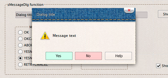
The property allows to colorize all modal buttons in the application.
Automatically will be colored buttons with mrOk, mrYes, mrCancel and mrNo modal results.
Buttons in skinned system dialogs will be colored too. The ColorizeModalButtons property has bcBackground, bcGlyph and bcText sub-properties. These sub-properties specifies a part of button which will be colored. The TsSkinManager.Options.DrawNonClientArea property Allows to disable a skinning of forms borders and titles in whole application, including system dialogs. Set this property to False if borders and titles of all forms must have a standard looking. 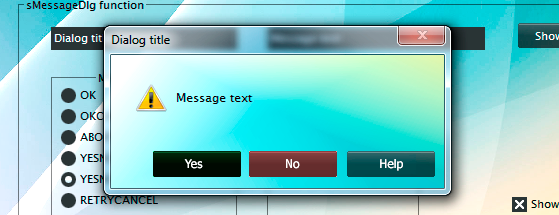
Other changesAdded new default icons in the package. All icons may be more universal now, scalable and not depended from a skin color scheme. 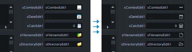
Style of default glyphs may be changed using the TsSkinManager.ButtonsOptions.OldGlyphsMode property. Set this property to False for showing of new style icons. Added set of colors which are received from the current skin and changed dynamically when skin is changed. These colors are defined in the sConst unit as slBtnRed, slBtnRedActive, slBtnRedText and so on. Using of these colors may help to colorize custom controls, which must be highlighted. Buttons may be colored using the SkinData.ColorTone property. Edit controls may use custom color if SkinData.CustomColor is True. All skin colors may be converted to the RGB format using the special acColorToRGB function, declared in the sVCLUtils unit. This function may be used for converting of standard colors (like clBtnFace, clWindow, etc) to the current skin colors values.
slBtnRed
slBtnRedActive
slBtnRedText
slBtnRedActiveText
clBtnFace
clWindow
clWindowFrame
clHighlight
Same colors for the Material Dark skin:
slBtnRed
slBtnRedActive
slBtnRedText
slBtnRedActiveText
clBtnFace
clWindow
clWindowFrame
clHighlight
Improved behavior of the TsSkinManager.ButtonsOptions.ShiftContentOnClick property. If this property if True, then content of all buttons in application will be moved down to one pixel if clicked. If ShiftContentOnClick property is False, then this behavior of controls is depended from the current skin options.  |
|
Installing, using and licensing the demo programs
© Sergii Goncharov, Ukraine, Odessa 2004-2023
| |
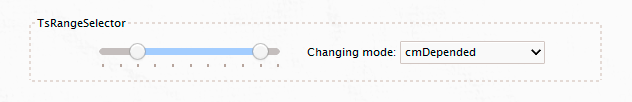
 The TsRangeSelector component can be used to define a range. By moving of two available sliders different ranges may be selected.
Behavior of sliders may be specified by the ChangingMode property, one slider can have influence to other or may have autonomous behavior.
The TsRangeSelector component can be used to define a range. By moving of two available sliders different ranges may be selected.
Behavior of sliders may be specified by the ChangingMode property, one slider can have influence to other or may have autonomous behavior.
 The ImageList component where chars from fonts used as source for glyphs.

 This is a round button which may be pinned to any other control.
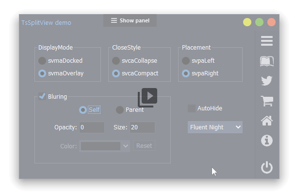
 An extended SplitView component with support of AlphaSkins, additional top/bottom positioning and graphic effects
 Component allows to embed own custom fonts into application.