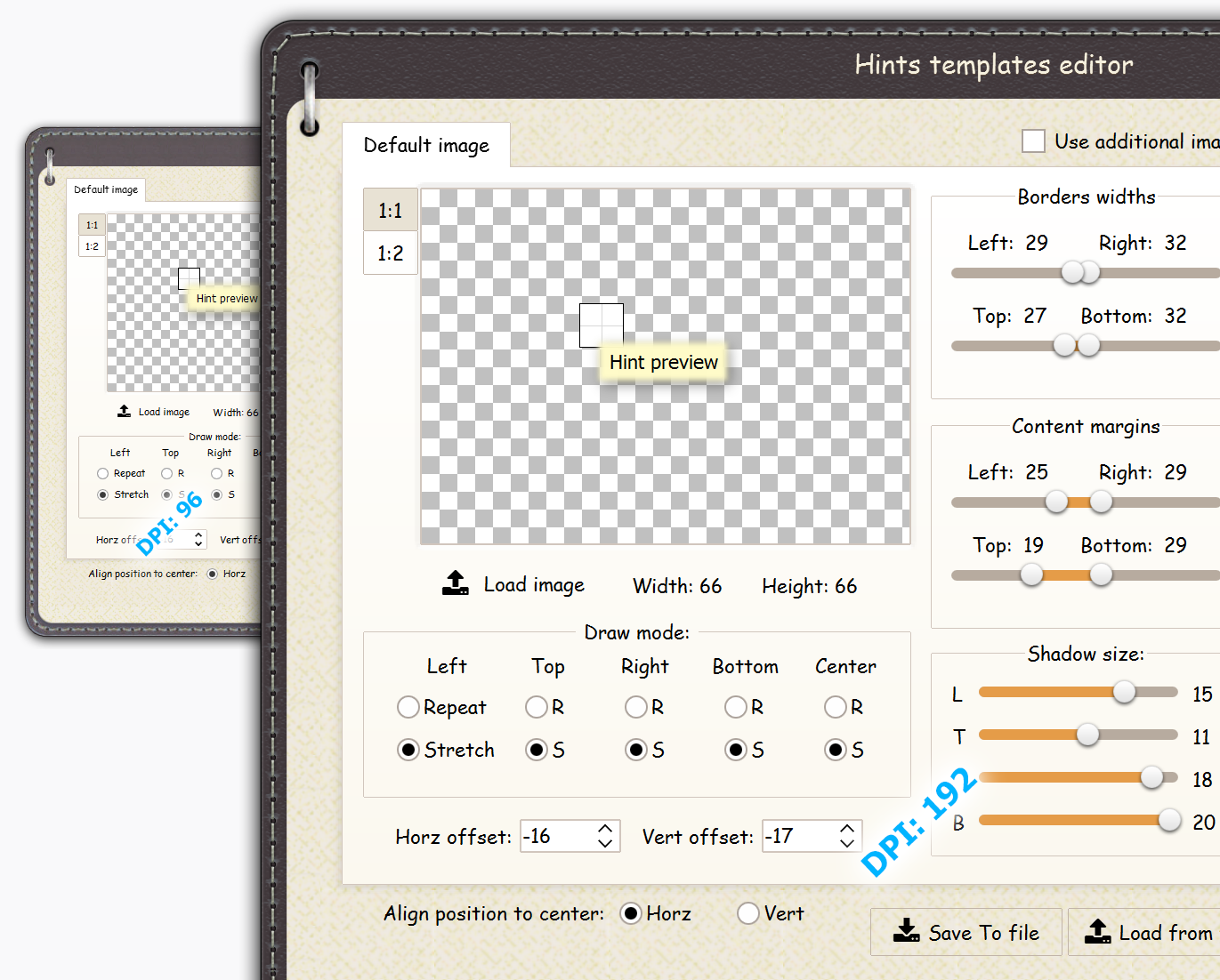
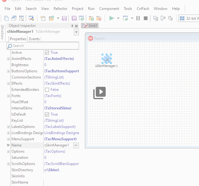
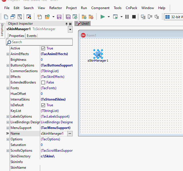
TsSkinManager
The component is designed for centralized management of program skinning process. For work of this component is enough to define a used skin and set the Active property to True.
There are two ways of skins deploying with the application:
№1. Adding skins into the InternalSkins list, we call them as "internal" skins. In this case, you should add them to the InternalSkins list, using a special design-time property editor. Skin is applied to the application after selection of his name in the SkinName property. All skins contained in the InternalSkins list will be included in the Exe-file automatically.
№2. Deploying of skins as separate files, we will call them as "external". Usually they are placed in a separate folder which will be deployed with application. Skin is applied to the application, if directory with external skin is specified in the SkinDirectory property, and his name is defined in the SkinName property.
These two ways may be combined. If external skin is not found or not accessible, then first internal skin will be loaded automatically in this case.
Component is active only when the Active property is enabled. Please, note - if a loading of skin fails (for example, if the skin is not selected), then Active property is changed to False automatically and program will have a standard look.
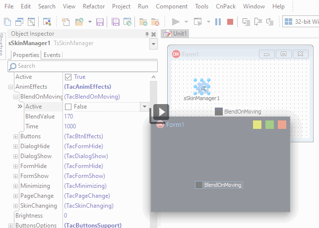
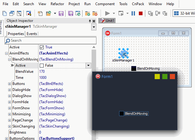
The AnimEffects structure contains a set of animation settings for different events:
-
BlendOnMoving - If "Active", then forms will be semitransparent while dragged. "Time" defines a time of animation process. "BlendValue" specifies a degree of the form transparency (0..255).
-
Buttons specifies events which will be animated in buttons.
-
DialogHide, DialogShow, FormHide, FormShow allows to control animation of showing and hiding of dialogs and forms.
-
Minimizing allows to control animation of forms minimizing and restoring.
-
PageChange controls an animation of pages switching in the TsPageControl component.
-
SkinChanging controls an animation of skins switching.
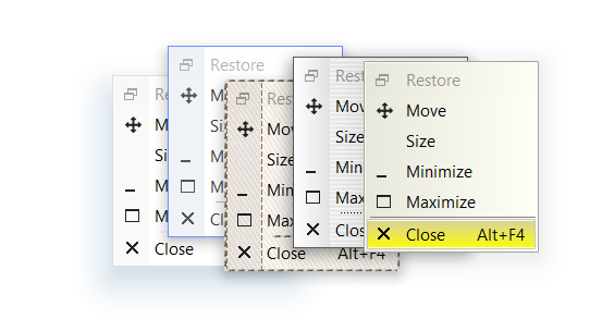
 Before running of animation effect the image in memory is created (prerendering). This feature may be useful even if animation is not used. For example, if a form contains a lot of controls and showing of this form is slow, you can set the animation time to 0, Active to True. Then the whole image will be produced in the memory, and the form will appear almost instantly.
The FormShow animation will work better if the TsSkinProvider component is placed on the form in design-time.
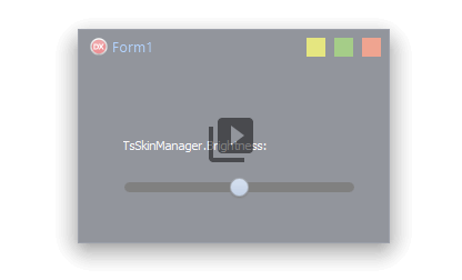
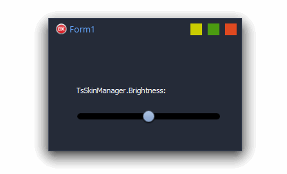
The Brightness property allows to changes a brightness of whole application in the run-time.
The ButtonsOptions structure contains settings for all buttons in whole application:
-
AllowRTLSysButtons - If True then system buttons in forms captions changes their position when bmRightToLeft bidimode used. Otherwise, positions of system buttons are not changed.
-
ModalButtonsColoring changes colors of modal buttons or theirs elements according to the buttons modal result value.
-
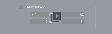
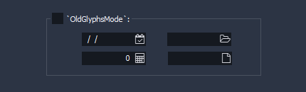
OldGlyphsMode enables an old look of built-in glyphs for standard buttons. Default value of the property is False. New modern scalable buttons used in this case.
-
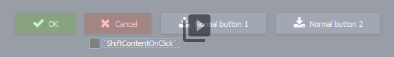
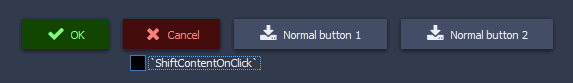
ShiftContentOnClick enables shifting of captions and glyphs in buttons when pressed. This shifting may be forbidden in a skin directly (when skin is edited).
-
ShowFocusRect allows to forbid showing of focus rectangles in whole application. Drawing of focus is disabled by default.
The CommonSections property allows add new sections to the skin in real-time. If new section is defined in this property, then this section will be automatically added to each applied skin. For example, we need a white panel in the each applied skin, but borders should be inherited from the "PANEL" section of this skin. Then we should open CommonSections and add such section there:
[PANEL_WHITE]
PARENTCLASS=PANEL
GRADIENTPERCENT=0
IMAGEPERCENT=0
COLOR=16777215
Now it is sufficient in the panel or in other control to change the SkinData.SkinSection property to "PANEL_WHITE" and component will have a new look.
Example of the CommonStyle property using may be downloaded there.
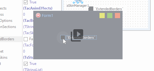
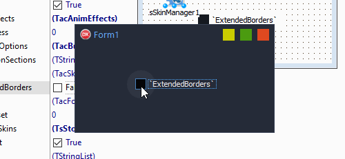
The ExtendedBorders enables a using of extra borders in forms and dialogs of application. Usually these additional borders are used for adding of shadows to forms, but they can implement and other effects also.
The Fonts property allows to control a used font in whole application from one point.
HUEOffset specifies an offset of color palette in whole skin. Some skins are configured with forbidding of title icons colors changing.
InternalSkins contains skins, embedded in the Exe-file. Adding skins produced in the design-time with using a special dialog. Number of skins which may be embedded in Exe, is not limited, but a large number of built-in skins can greatly increase a size of executable file. The "Update all" button allow to update all internal skins in design-time by a single click. A source directory with newer versions of skins is shown as "External location" in the upper left corner of the dialog.
The IsDefault property determines a skin manager which will be default for all application (DefaultManager). If application has defined several skin managers, then DefaultManager will be used for skinning of dialogs, as well as for all forms and controls which do not have a manager specially defined in the SkinData.SkinManager property. DefaultManager always the first to be created, or the first created by the manager will be a key.
Purpose of the Keylist property is storing of keys for using of encoded skins. The ASkinEditor tool allow to encode any skin with a special unpacking key. If such skin used in the application without key, then user will see a message that used non-registered skin. Also, such skin, can't be unpacked and changed in the ASkinEditor tool by third persons.
The LabelsOptions property allows to control a behavior of labels in whole application from one point.
The MenuSupport structure allow to control a process of the popup menus skinning.
-
AlphaBlend defines a level of popup menus transparency.
-
The CustomFont property specifies when custom font should be used. Default value is False.
-
 ExtraLineFont sets the font for the additional vertical bar in popup menu, which may be enabled in the UseExtraLine property and managed by OnGetMenuExtraLineData event.
-
ExtraLineWidth - width of extra line.
-
The Font property defines a font which will be used in popup menus. This property is not active while CustomFont is False.
-
IcoLineSkin - a section of the skin, is responsible for drawing the vertical bar under icons of menu items.
-
SkinnedShadows replaces standard system shadows of menus windows by shadows from the current skin.
-
UseExtraLine - enables an additional rendering mode of the menu bar. If this property is set, then additional vertical bar will be drawn at all drop-down menus. For configuring this mode use the OnGetMenuExtraLineData event. Description of this event is below.
The Options structure contains a set of common parameters which allows to change a behaviour of the skin engine in whole application.
-
ArrowsStyle allows to change a style of all arrows in whole application from one point.
-
ChangeSysColors allows to replace system colors in application (clWindow, clBtnFace, etc) by colors specified in the current skin.
-
CheckEmptyAlpha. If property is enabled, then drawing of 32bpp icons is processed with checking for empty alphachannel. This property can help if icon is not visible because alphachannel exists but is empty.
-
DrawNonClientArea. Using this property can help to forbide drawing of skinned non-client area at all forms in the application (if needed).
-
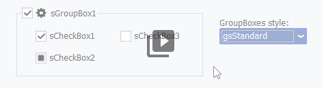
GroupBoxStyle changes style of groupboxes in whole application.
-
NativeBordersMaximized. If enabled then ExtendedBorders will not be used on maximized form. The property can help to solve a problem with unaccessible autohidden taskbar when application is maximized.
-
NoMouseHover forbids "hover effects" when mouse hover the component. May be useful for work of application on devices with touch-screens.
-
OptimizingPriority (opMemory, opSpeed) - the property defines a priority of optimizing. Result of such optimizing may be noticeable, for instance, in switching between pagecontrol pages. If opSpeed is chosen, then image of component will be stored in cache when component is not visible. Repeated showing of this control will be faster because image exists already. If opMemory is chosen, then a cached image is cleared when component is not visible.
-
NoMouseHover forbids "hover effects" when mouse hover the component. May be useful for work of application on devices with touch-screens.
-
PixelsPerInch specifies required PPI of the application when smCustomPPI mode used in the ScaleMode property.
-
ScaleMode allows to use different ways of the application scaling. For more information look this separate article.
-
StdGlyphsOrder defines standard order of icons in buttons when Numglyphs more than "1". If disabled then second icon used when button is drawn as "Hot". If property is disabled then second icon used for drawing of disabled component.
-
StdImgTransparency specifies a way of GraphiControl drawing. The property can help to solve some issues in painting of GraphicControls placed one on the each other.
Saturation - changes saturation of the current skin for the whole application.
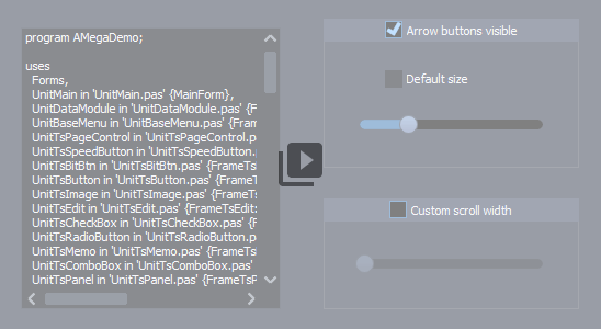
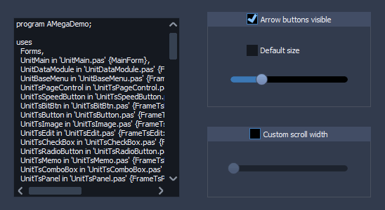
The ScrollsOptions allows to change dimensions and behavior of scrollbars in whole application.
-
ButtonsSize specifies size of buttons in scrollbars. If value is "-1" then system sizes are used, if Value is "0" then buttons are not visible.
-
ScrollSize specifies size of scroll bar. If value is "-1" then size received from the Windows system.
SkinDirectory - directory where component should look for external skins. If used embedded skins only, this property may be not defined.
SkinInfo stores information about the active skin.
SkinName specifies a skin which should be activated. Name of skin should be specified without a file extension.
SkinnedPopups disables a skinning of menus. If this property is False, then menus will be drawn by windows system.
SkinningRules contains some rules of the application skinning.
-
srStdForms enables an automatic skinning of all new forms which inherited from TForm class.
If a skin should be applied to custom forms only, then this property must be False and TsSkinProvider component must be placed to such forms in design-time.
-
srStdDialogs enables a skinninf of system dialogs.
-
srThirdParty allows to apply a skin for standard and third-party controls.
SkinsFilter adds filtering of accessible skins to the component.
This property may be usefull for such components as TsSkinSelector. List of available skins will be filtered there.
If `sfiInternal` is enabled then internal skins are accessible for choosing.
If `sfiExternal` is enabled then external skins (in *.asz files) are accessible for choosing.
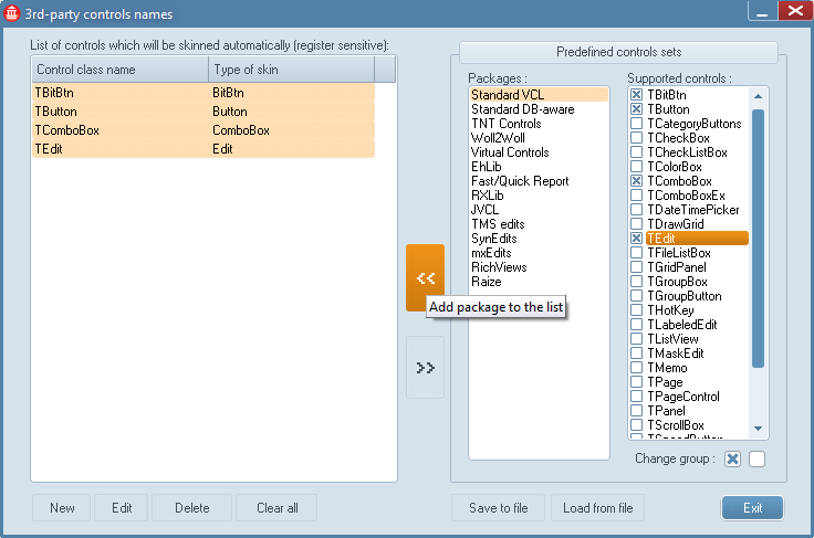
The ThirdParty list contains rules of a skin applying for standard and third-party controls.
Skinning of standard and third-party controls works only when SkinningRules.srThirdParty is True и and form is skinned (it is desirable to place the TsSkinProvider component on this form in design).
A special property-editor used for a changing of this list in design-time. At the left is a list of types which should be skinned. It's possible to add all items manually by using of bottom toolbar. But may be used a special lists with predefined sets of components, which is on the right. Please note, that names of types are case-sensitive there.
The Version property stores the current version of the package.
The Palette array doesn't exists in the Object inspector, but accessible at the run-time.
This array contains all common colors of the loaded skin, which may be changed by developer.
Available indexes for this array:
TacPaletteColors = (pcMainColor, pcLabelText, pcWebText, pcWebTextHot, pcEditText, pcEditBG,
pcSelectionBG, pcSelectionText, pcSelectionBG_Focused, pcSelectionText_Focused,
pcEditBG_Inverted, pcEditText_Inverted, pcEditBG_OddRow, pcEditBG_EvenRow,
pcEditText_Ok, pcEditText_Warning, pcEditText_Alert, pcEditText_Caution, pcEditText_Bypassed,
pcEditBG_Ok, pcEditBG_Warning, pcEditBG_Alert, pcEditBG_Caution, pcEditBG_Bypassed,
pcEditText_Highlight1, pcEditText_Highlight2, pcEditText_Highlight3,
// Round buttons colors
pcBtnColor1Active, pcBtnColor2Active, pcBtnBorderActive, pcBtnFontActive,
pcBtnColor1Normal, pcBtnColor2Normal, pcBtnBorderNormal, pcBtnFontNormal,
pcBtnColor1Pressed, pcBtnColor2Pressed, pcBtnBorderPressed, pcBtnFontPressed,
pcBorder, pcGrid, pcHintBG, pcHintText);
Events
OnActivate occurs immediately after a component activation.
OnAfterChange occurs after changing of the current skin.
OnBeforeChange occurs before changing of the current skin.
OnDeactivate occurs after a skins deactivation.
OnFontChanged event occurs when the MainFont property is changed.
OnGetMenuExtraLine called before a drawing of the popup menu, if MenuSupport.UseExtraLine property is active. Additional left vertical line will be drawn if LineVisible parameter is True. FirstItem parameter points to the first menu item for this popup menu. Focusing on this option you can enable or disable the extra line, also may be defined such parameters as SkinSection, Caption, and Glyph. Example of handling of this event may be found in ASkinDemo and ASLDemo.
The OnGetPopupItemData event occurs before a drawing of popup menu and allow to define a font for an each menu item.
OnScaleChanged event occurs after changing of the application scaling.
OnScaleModeChange event occurs after changing of mode of application scaling (Options.ScaleMode property).
OnSkinChanging the event occurs before changing of skin and allows to cancel this changing.
OnSkinListChanged occurs when a list of internal skins is changed and when SkinDirectory property is changed.
OnSkinLoading occurs after a skin activation immediately.
OnSysDlgInit occurs when a system dialog is opened, and contains such parameters as window Handle and AllowSkinning. The event allows to disable a skinning of custom dialog.
 AllowGlowing enables a glow effect which occurs when mouse is moved over a control, as well as system buttons in the window title.