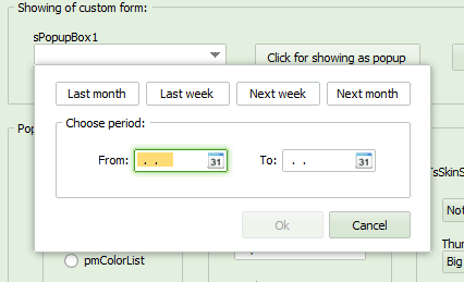
This component have a look of ComboBox control and allows to show any form as popup window instead of ComboBox list.
Firstly, should be created the form which will be shown after clicking on the TsPopupBox control.
After creation this form must be specified in the TsPopupBox.PopupForm property.
After clicking on the TsPopupBox by mouse or after pressing of "Alt+Down" the popup form will be shown.
Further processing of user actions is handled by developer.
For example, the "Ok" button may be placed which will close the form and will change the TsPopupBox.Text property.
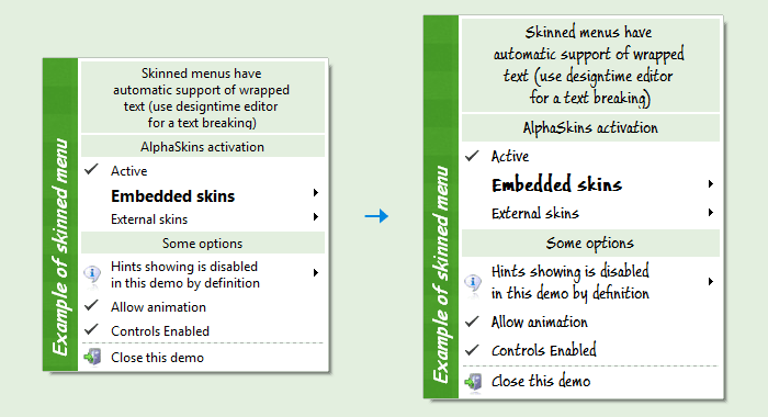
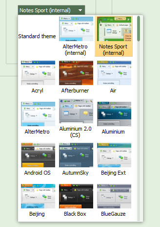
 This component searches available skins automatically and shows them in the popup list with preview.
Changing of the current skin called automatically after choosing by user.
This component searches available skins automatically and shows them in the popup list with preview.
Changing of the current skin called automatically after choosing by user.
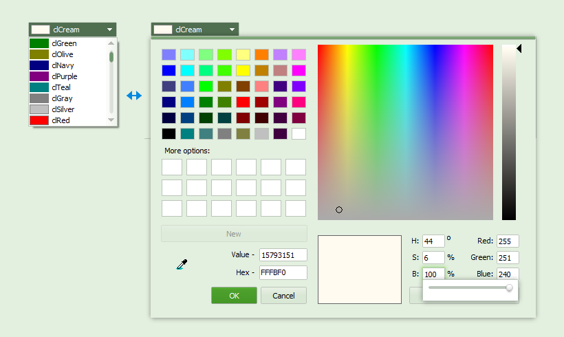
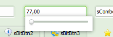
 This component allows to edit numbers with help of the popup window with TrackBar.
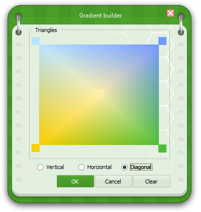
 This is a panel which filled by custom gradient.
It's possible to use a color of the current skin for visually compatibility with all skins.
This is a panel which filled by custom gradient.
It's possible to use a color of the current skin for visually compatibility with all skins.
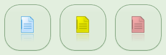
 Properties specifies a glyph which may be shown in the component caption area.
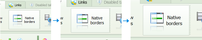
 Component uses a fixed aspectratio which has been specified in the skin image.