|
NO WAR IN
UKRAINE!
 Home
Products
Skins gallery
Tutorials
Buy
Downloads
Demo-apps
Updates history
Feedback
Customers
Partners
Forum
Sign up for news
Windows 11
Compatible
|
New in the AlphaControls 2019 (version 14)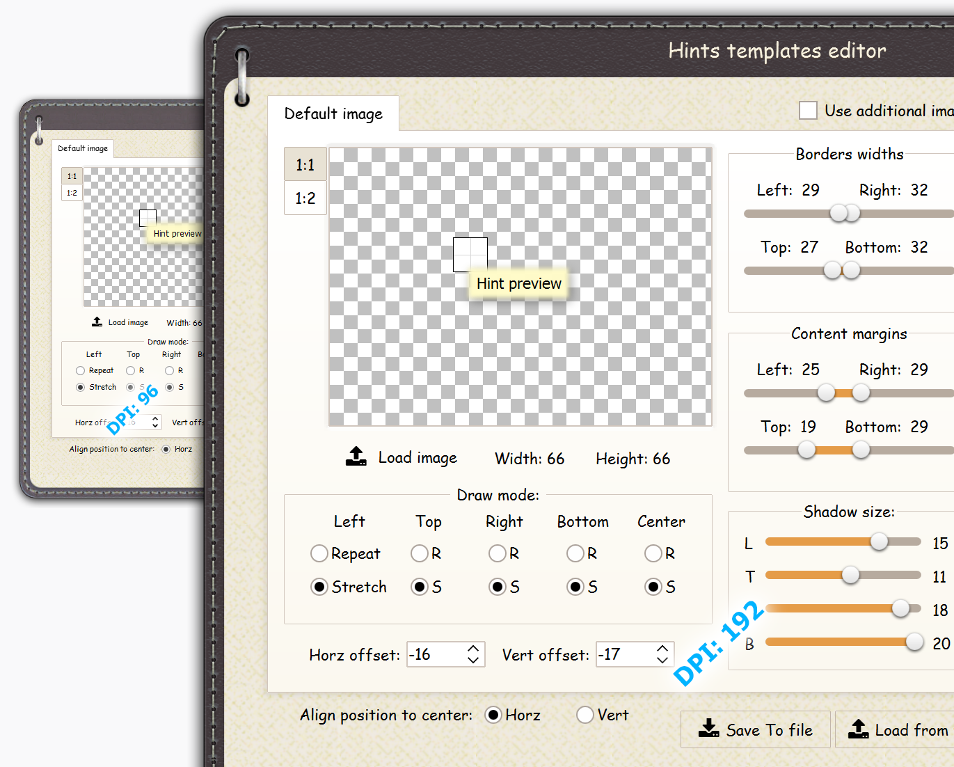
A scaling-engine has been rewritten completely. Improved internal structure of skins, added support of per monitor scaling under Window 10. "DPI Awareness" mode from latests RAD Studio was supported. New "smVCL" and "smCustomPPI" parameters has been added in the TsSkinManager.Options.ScaleMode property. Several ways exists for scaling of applications with AlphaControls package: 1. Mode of compatibility with "DPI Awareness" option in latests RAD Studio. Use the "smVCL" parameter in the Options.ScaleMode property of the TsSkinManager component for enabling this option. Some notes for using with this mode:
2. Mode of automatic scaling of application by the package scaling engine. This mode is intended for automatic using of current OS DPI parameters in applications, compiled with old versions of Delphi. Use the "smAuto" parameter in the Options.ScaleMode property of the TsSkinManager component for enabling this option. 3. Manual specifying of custom DPI value for application. Use predefined "sm100", "sm125", "sm150", "sm200" parameters for changing of the application DPI. Also, the "smCustomPPI" parameter allows to set any other DPI for application. This DPI value may be defined in the Options.PixelsPerInch property of the TsSkinManager component. Few notes for using with (2) and (3) modes:
4. Mode of compatibility with old projects where any scaling information is not used. Use the "smOldMode" parameter for enabling this mode. Also the "ACDPIAWARE" compiler directive should be commented or removed in the sDefs.inc file. Also:
New componentsTsSysButton
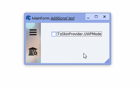
 Allows to mimic system buttons from usual forms titles, with possibility of these buttons showing in any place of form. Such buttons may be useful if title of form should be hidden with keeping of all form standard functionality. Example of these buttons using can see in the "ChatDemo" program. New propertiesTsSkinProvider.UWPMode property The property allows to disable visibility of borders and form title with keeping of standard form functionality. Can help to mimic a UWP design in application. If BorderStyle property of form is bsSizeable, then user can resize the form as usual. If TsSkinManager.ExtendedBorders property is activated, then shadows of form will be shown automatically, in dependence from current skin configuration. 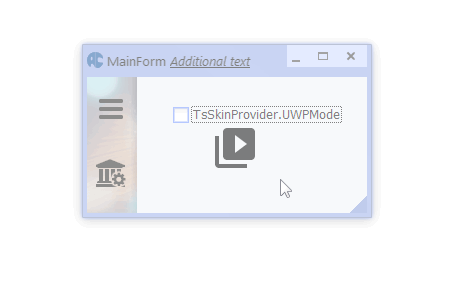
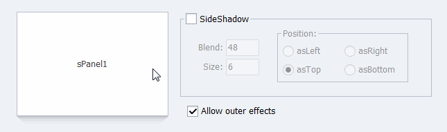
The SideShadow property in the TsSplitView, TsPanel, TsPageScroller and sMonthCalendar components 
Allows to draw an additional shadow within the component. If shadow must be visible, then "Mode" subproperty must be changed to ssmInternal. The "Blend" subproperty can control a transparency of the shadow. The "Side" subproperty specifies a position of the shadow.. Color and size of shadow are depended from current skin configuration. The TsScrollBox.WheelDelta property Allows to control a speed of component scrolling by a mouse wheel. The ButtonWidth property in SpinEdits and ComboEdits of the package Allows to specify a width of button manually. Default value is 0 (calculated automatically). The Padding property in the TsEdit, TsTrackEdit, SpinEdits, ComboEdits and other components Allows to define an additional spacing between borders and content of components. The VerticalAlignment property in the TsEdit, TsTrackEdit, SpinEdits, ComboEdits and others components Allows to define a vertical aligning of the components content. 
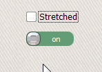
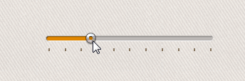
The TsSlider.Stretched property Allows to stretch an image of component when size of the component is changed. 
The TsPageControl.Padding property Allows to specify an additional spacing between control and his bounds rectangle. 
The TsPageControl.ShowDropDownBtn and TsPageControl.ShowNextPrev properties Allows to enable/disable a visibility of scroll buttons and of the dropdown menu button. The TitleHeight property in the TsMonthCalendar and TsDateEdit components Allows to change a height of title in the component. The PosByClick property in the TsTrackBar and TsTrackEdit components Allows to change a position of thumb by clicking without dragging. 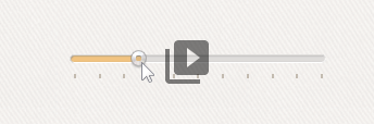
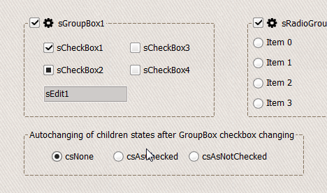
The TransparentForMouse property in labels Makes label transparent for mouse messages parent control will receive all mouse messages. The TitleBtnsWidth property in the TsMonthCalendar and TsDateEdit components Defines a custom size of navigation buttons in calendar. The AutoChildrenStates property in the TsGroupBox component Allows to change the Enabled property of all child controls automatically. 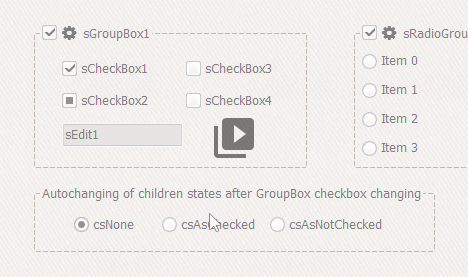
The ImgGrayed property in the TsCheckBox component Defines a custom image for undefined state of the TsCheckBox component. The SideShadow.ShadowSize property in the TsPanel and TsSplitView components Specifies a size of internal side shadow of the component. 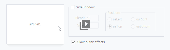
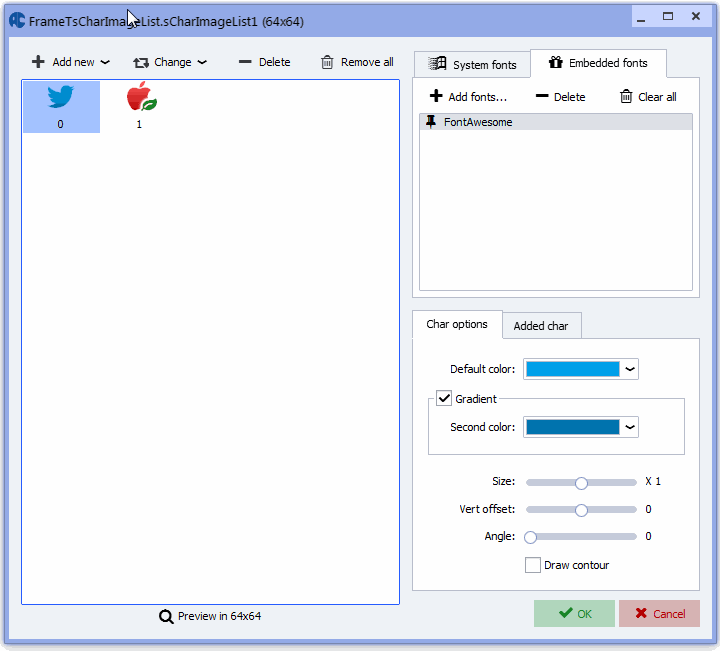
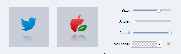
Added subimage drawing and gradient items drawing in the TsCharImageList component 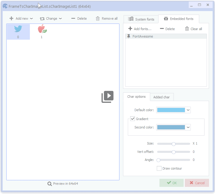
The ReadOnly property in the TsArcDial and TsArcHandle components Allows to disable changing of controls values by user. The VertIndent property in the TsSysButton component
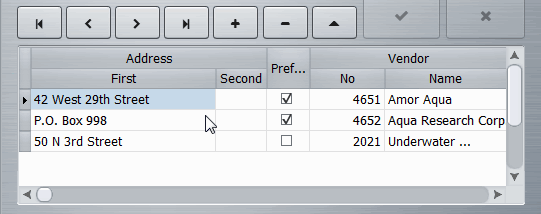
Allows specify a vertical offset of the button when DrawAsIcon property is True. The BoolAsCheckbox and ImmediateToggle properties in the TsDBGrid columns Allows to show boolean values of fields as checkboxes. 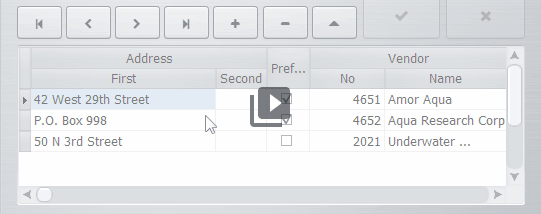
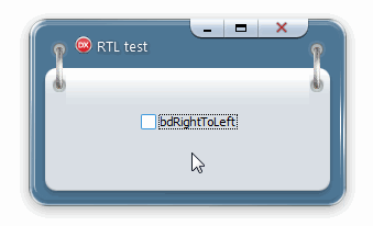
Added horizontal flip of system icons when RTL mode is enabled 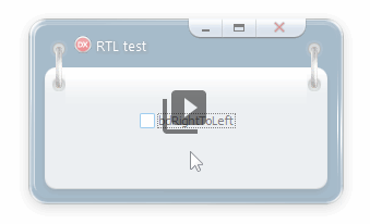
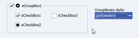
The TsSkinManager.Options.GroupBoxStyle property Allows to change a style of TsGroupBox and TsRadioButtons components in whole application. 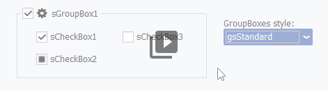
The BlendValue and BlendingMode properties in the TsCharImageList component Allows to make blended glyphs in whole application where the TsCharImageList component used. 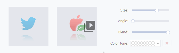
 |
|
Installing, using and licensing the demo programs
© Sergii Goncharov, Ukraine, Odessa 2004-2023
| |

 This is a usual button with predefined actions.
Used action and a look of the button may be specified in the "SysCommand" property.
This is a usual button with predefined actions.
Used action and a look of the button may be specified in the "SysCommand" property.
