|
NO WAR IN
UKRAINE!
 Home
Products
Skins gallery
Tutorials
Buy
Downloads
Demo-apps
Updates history
Feedback
Customers
Partners
Forum
Sign up for news
Windows 11
Compatible
|
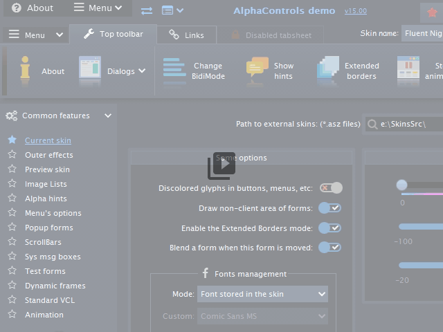
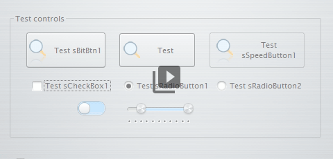
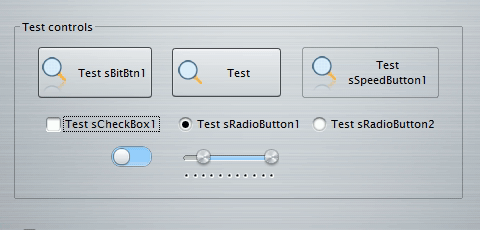
New in the AlphaControls 2020 (version 15)New animationsNew types of animations were added in the version 15 for support of Fluent design conception in the AlphaControls package. New animation procedures were added for using by developers and old procedures were improved. Buttons, radiobuttons, checkboxes and some other components has the AnimatEvents property where may be defined which types of animations are enabled. All these options are included in the AnimEffects.Buttons property of the TsSkinManager component. This property allows to control all animation effects in the application from one point. All controls has the AnimatEvents.aeGlobalDef property enabled by default. Animation effects in the control are controlled by TsSkinManager.AnimEffects.Buttons property in this case. If the AnimatEvents.aeGlobalDef parameter of the control is disabled, then control uses own animation options.
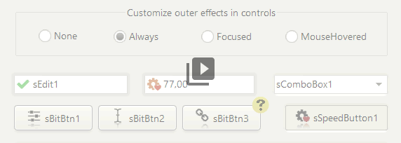
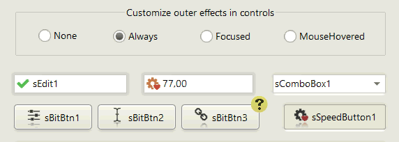
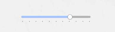
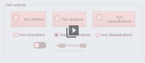
In the AlphaControls v15, additionally to aeMouseEnter, aeMouseLeave, aeMouseDown and aeMouseUp parameters, were added new aeLighting and aeClick parameters. For support of animation the TsSlider component has been fully rewritten. Also, the AnimatEvents property has been added there. The Stretched property is enabled now by default. These and other new properties with more details are described below. New propertiesAnimEffects.Buttons.beLighting in the TsSkinManager, AnimatEvents.aeLighting in controls
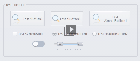
Enables a "lighting" animation in controls which has the AnimatEvents property.
This type of animation reacts to moving of mouse above the control or near, and changes a looking of the control.
Look of the control is depended from distance to the mouse cursos and from colors defined in the current skin.
The AnimatEvents.aeClick property in buttons
The property enables animation effect which occurs after clicking on the control.
The TsSkinManager.AnimEffects.Buttons.ClickEffect property The property changes type of clicking animation in whole application. Available effects: ceCircle, ceWaveOut and ceCircleAndWave. 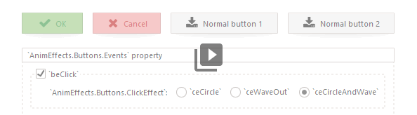
TsSkinManager.AnimEffects.PageChange.Mode property The property changes type of pages changing animation in whole application. Available effects: atcFade, atcBlur, atcRunup. The TsPageControl component has the AllowAnimSwitching property which allows to forbid this effect for the control. 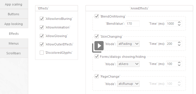
The UseAlpha property in the TsColorsPanel component Enables full support of 32-bit colors. 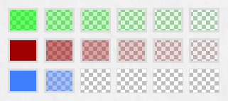
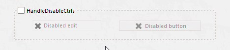
The TsAlphaHints.HandleDisabledCtrls component Allows to show hints for disabled controls. 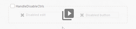
The TsSkinProvider.SystemBlur property Allows to enable a support of the Windows system forms blurring on the current form. Change the Active property to True if form must be blurred (or part of form except the TsPanel with SkinData.OpaqueMode property changed to omForceOpaque). If SystemBlur.Mode property defined to bmAcrylicBlurBehind then under Windows 10 used acrylic blur if possible. The TsSplitView component have the TsSplitView.BlurData.UseSysBlur property, which allows to have different semitransparent panels with support of system bluring. Supported Windows versions - Windows 7 (if Aero is enabled) and newer. Download the demo. 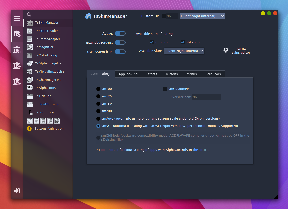
The TsComboBox.LabelFromTextHint property The property makes an animated moving of text from the TextHint property to the BoundLabel of the TsComboBox control. This effect occurs if TextHint property is defined, BoundLabel is not active and control receives a focus. 

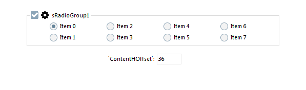
The TsSplitView.BlurData.UseSysBlur property Set this property to True if TsSplitView should be transparent when the TsSkinProvider.SystemBlur.Active property is True. If Windows version is older then Windows 7 then TsSkinProvider.SystemBlur.Active property will not work and TsSplitView will not be transparent. The SkinData.OpaqueMode property Changes mode of opaque for the control and child controls placed on this control. This property should be used together with the TsSkinProvider.SystemBlur.Active property for correct filling of alpha-channel in controls when form is transparent and blurred (change OpaqueMode to omForceOpaque for that). Currently this property supported in the TsPanel control only. The HideEmptyText property in SpinEdits Allows to show control as empty when Value of the control is 0. The TsRadioGroup.ContentHOffset property Allows to align radiobuttons in the RadioGroup manually. 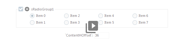
The LabelFromTextHint property in edit controls Enables an animation effect of moving of the HintText from control edit area to the area specified in the BoundLabel property. 
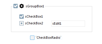
The CheckBoxRadio property in the TsGroupBox and TsRadioGroup components The property changes looking of checkbox to radiobutton in the groupboxes where the CheckBoxVisible property is enabled. 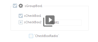
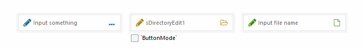
The ButtonMode property in ComboEdits The property disables direct input by keyboard and changes looking of the control. Control works as a button if ButtonMode is True. 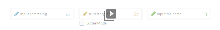
The TsSkinManager.MenuSupport.SkinnedShadows property The property replaces system shadows in menu popup windows. 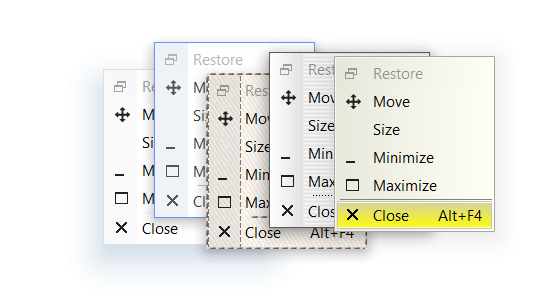
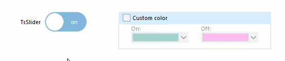
The ColorOn property in the TsSlider component Specifies a color of the control when SliderOn property is True. This property used when control is not skinned or SkinData.CustomColor property is True. The ovFocused and ovMouseHovered modes in the SkinData.OuterEffects.Visibility property Specifies when outer effect should be visible. Available modes:
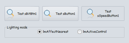
The LightingMode option in the TsSkinManager.AnimEffects.Buttons property The lmAffectNearest value specifies when lighting effect works in neighbor controls, the lmActiveControl value allows effect in the current active control only. 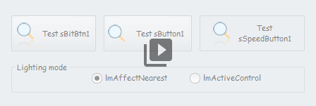
The TsTrackBar.OnGetToolTipInfo event The event allows to change a shown text and font in tooltips when the PositionToolTip property used. 
The TransparentForMouse property in the TsImageLabel, TsImage component and in panels All mouse messages are ignored by component and sent to the parent control, if the TransparentForMouse property is True. The ShowLines property in the TsListBox and TsCheckListBox components Allows to draw lines between items. The TsSlider.ColorOn property, added support of the SkinData.CustomColor property The SkinData.CustomColor, Color and ColorOn properties allows to define custom colors for the TsSlider component. 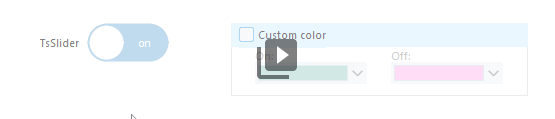
The FitScrollButtons property in the TsPageControl component Changes size of scrollbuttons in the TsPageControl component. StartAttention, StopAttention and RestartAttention procedures Allows to get a user attention to the custom control. Several types of animation are available, which may be defined with followed parameters:
Added OnColorPreview events in the TsColorDialog, TsColorBox and TsColorSelect components TacColorPreview = procedure(Sender: TObject; OriginColor, PreviousColor: TColor; var NewColor: TColor) of object; The event allows to use a new color for preview while this color is not accepted. Added new "arsSolid3" arrows style Changing of all arrows style in whole application is possible from a one point - the Options.ArrowsStyle property of the TsSkinManager component. New "arsSolid3" style has been added in the package v15. Other changesChanged the ASkinEditor tool
Added possibility of lightings color defining for skin sections in each possible state: 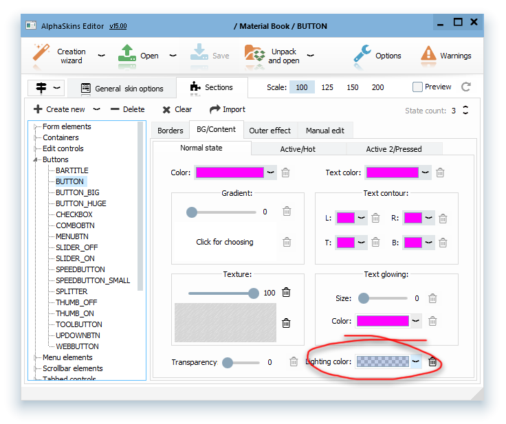
and default common lighting color for whole skin also: 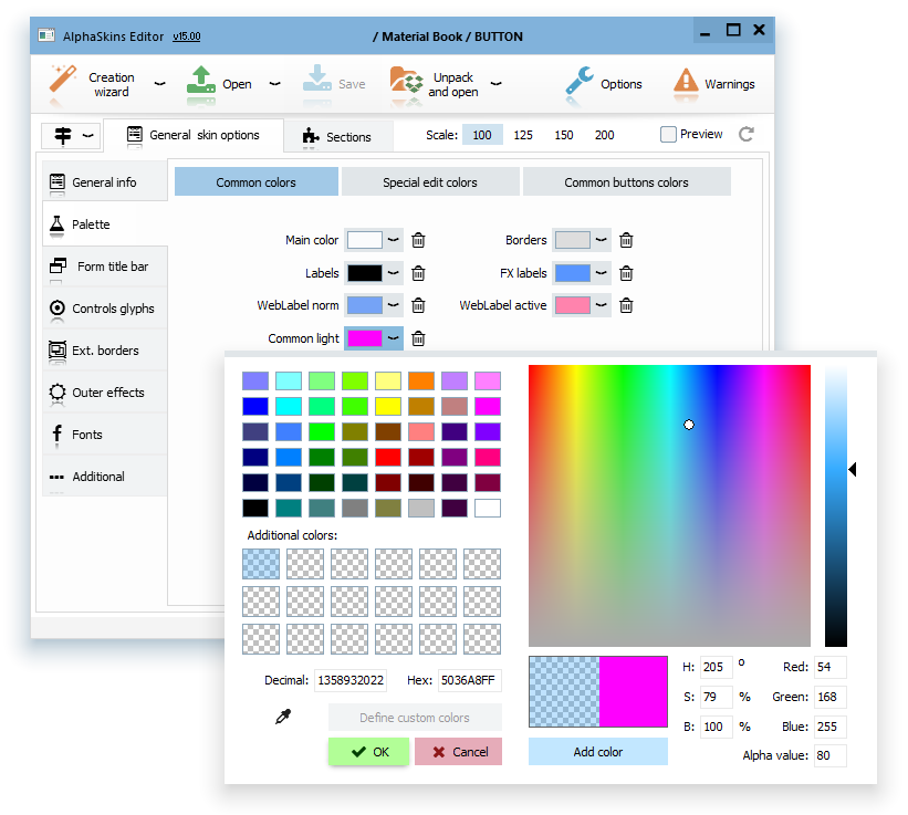
The "sFade.pas" unit renamed to "acAnimation.pas"  |
|
Installing, using and licensing the demo programs
© Sergii Goncharov, Ukraine, Odessa 2004-2023
| |
 But the TsSkinManager component has the Effects.AllowAnimation property also, which allows to disable whole animation in application, regardless of the settings of other components.